Carretto
In late 2024, I began a visual identity project for the Irish musical artist Carretto. This is a sneak peek of that project (published with the client's permission), which focuses on the concepts behind my design of Carretto's logo/monogram and promotional artwork for the songs on their debut EP, due to be released in the first half of 2025. Stay tuned for a full case study of this project a little later in the year.
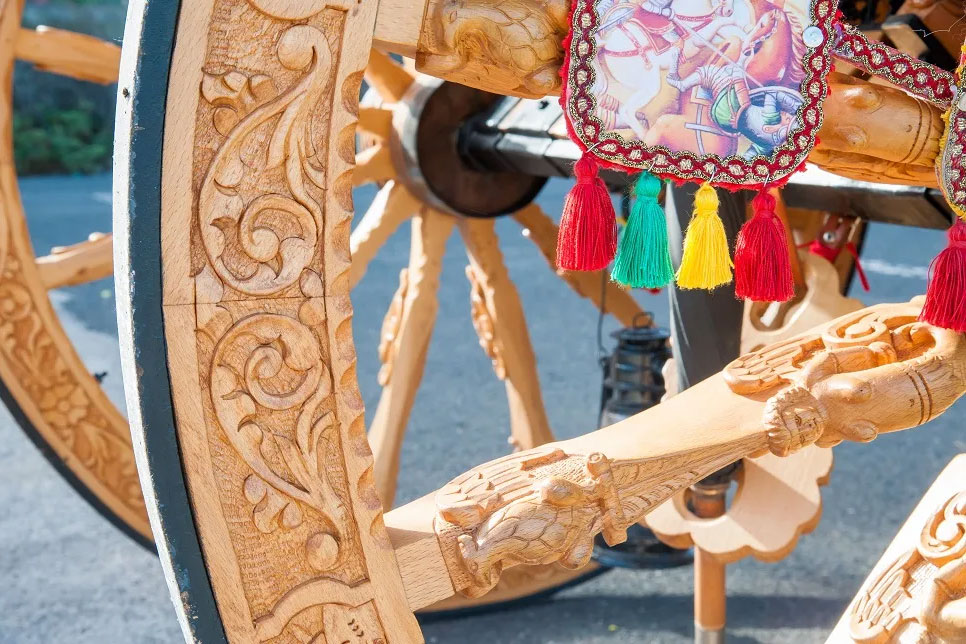
Close-up of a "carretto" (Sicilian cart).
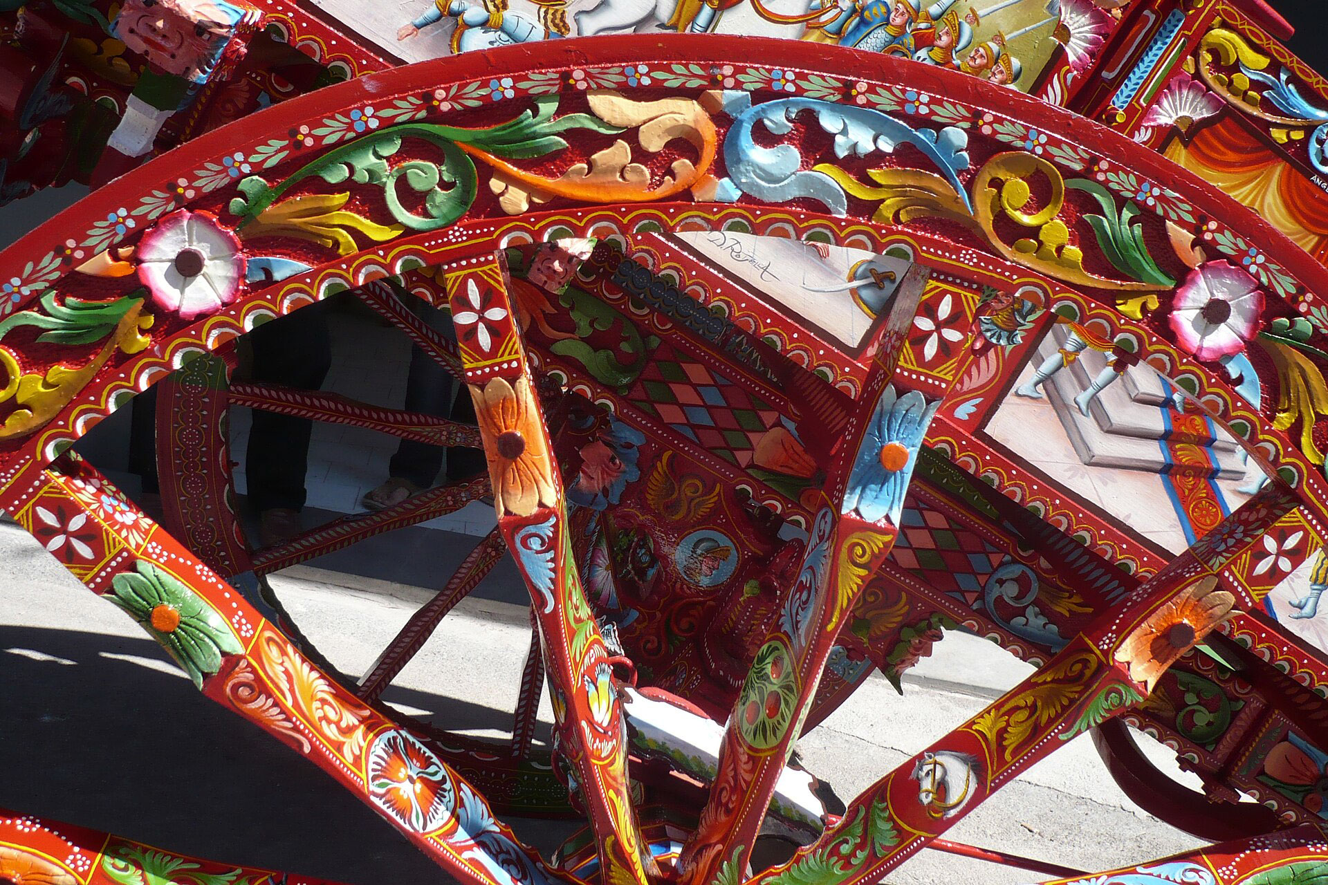
Close-up of a "carretto" (Sicilian cart).
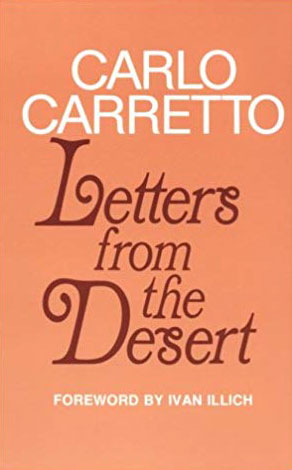
Carlo Carretto, Letters From The Desert, 1972.
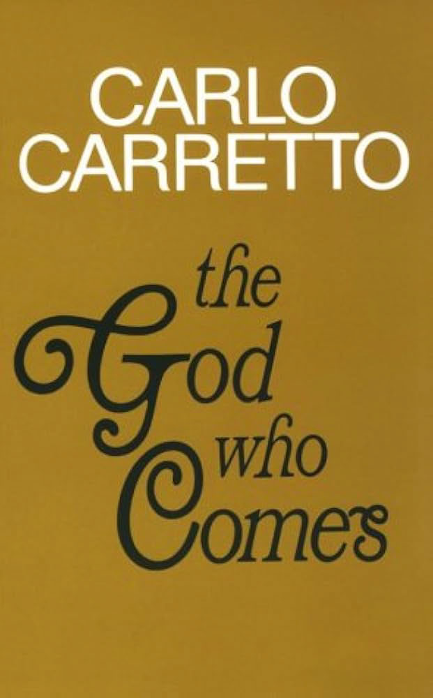
Carlo Carretto, The God Who Comes, 1974.
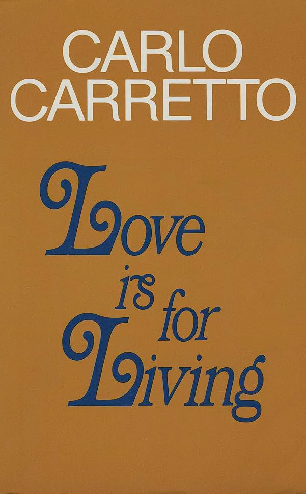
Carlo Carretto, Love Is For Living, 1977.
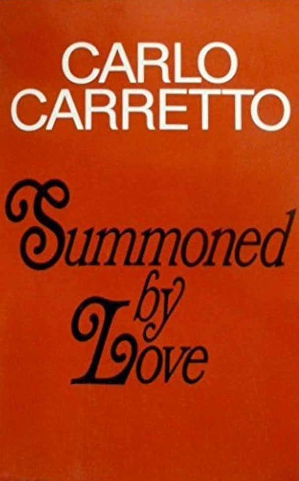
Carlo Carretto, Summoned By Love, 1978.
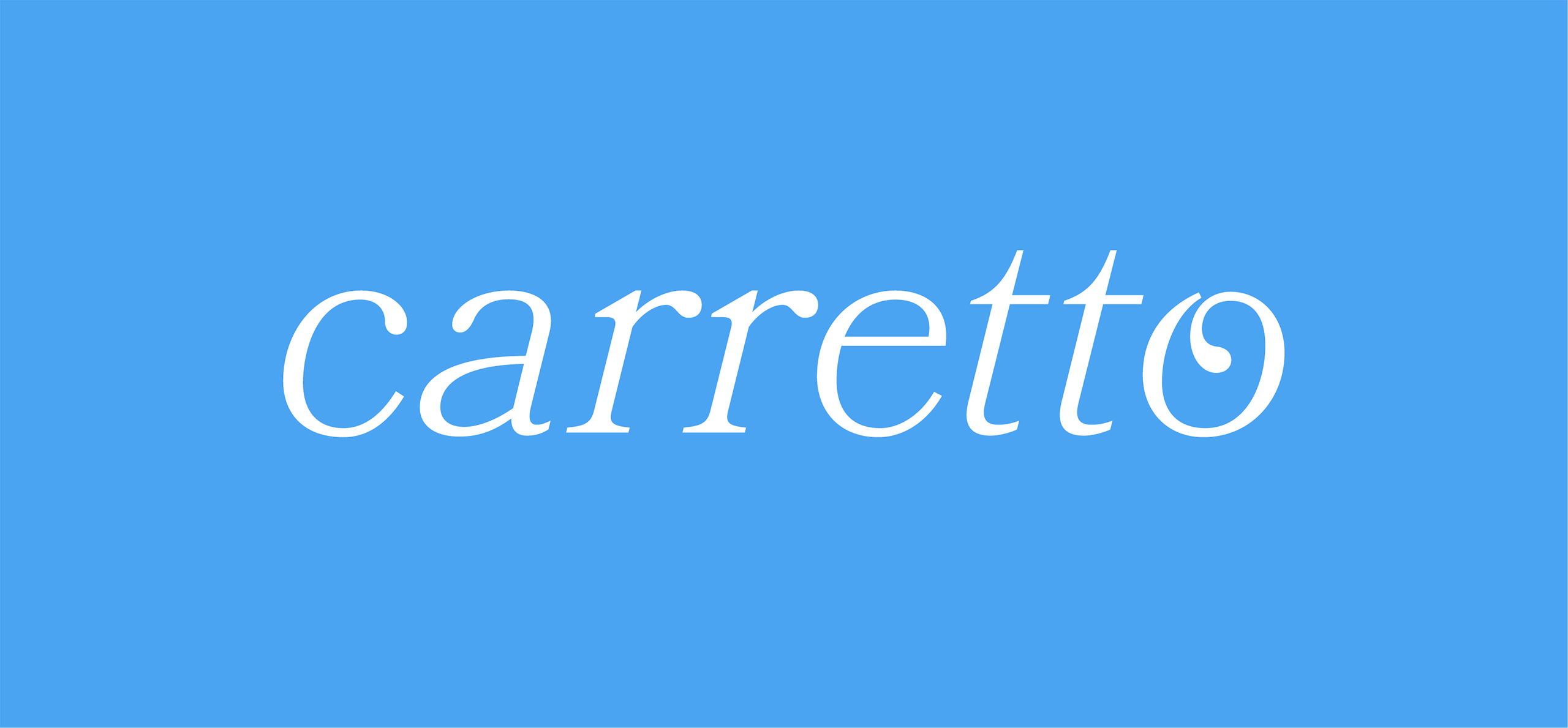
Logo design for Carretto (musical artist).

Monogram design for Carretto.
Logo Design
Carretto's name was inspired by the “carretto siciliano”, a traditional [Sicilian] horse or donkey cart decorated in an unusually colourful/ornate style, and Carlo Carretto, the Italian Catholic mystic and writer. Carretto's logo was inspired by the covers of the English-language versions of Carlo Carretto’s books, published in the 1970s.
The font used for the books' titles was Bookman (Italic version), a serif typeface that was popular in that decade. Bookman is known for its versions of letters with ornate swashes, which bear a similarity to the carretto siciliano's decorative patterns. The typeface I used for Carretto's logo design is Bookmania, a contemporary version (2011) of Bookman created by type designer Mark Simonson for the digital age.
Carretto's monogram design, intended for places where the primary logo wouldn't fit e.g., a social media profile picture, consists of the first and last letters of the logo joined together to create a capital “E”, the first letter of Carretto's real name.
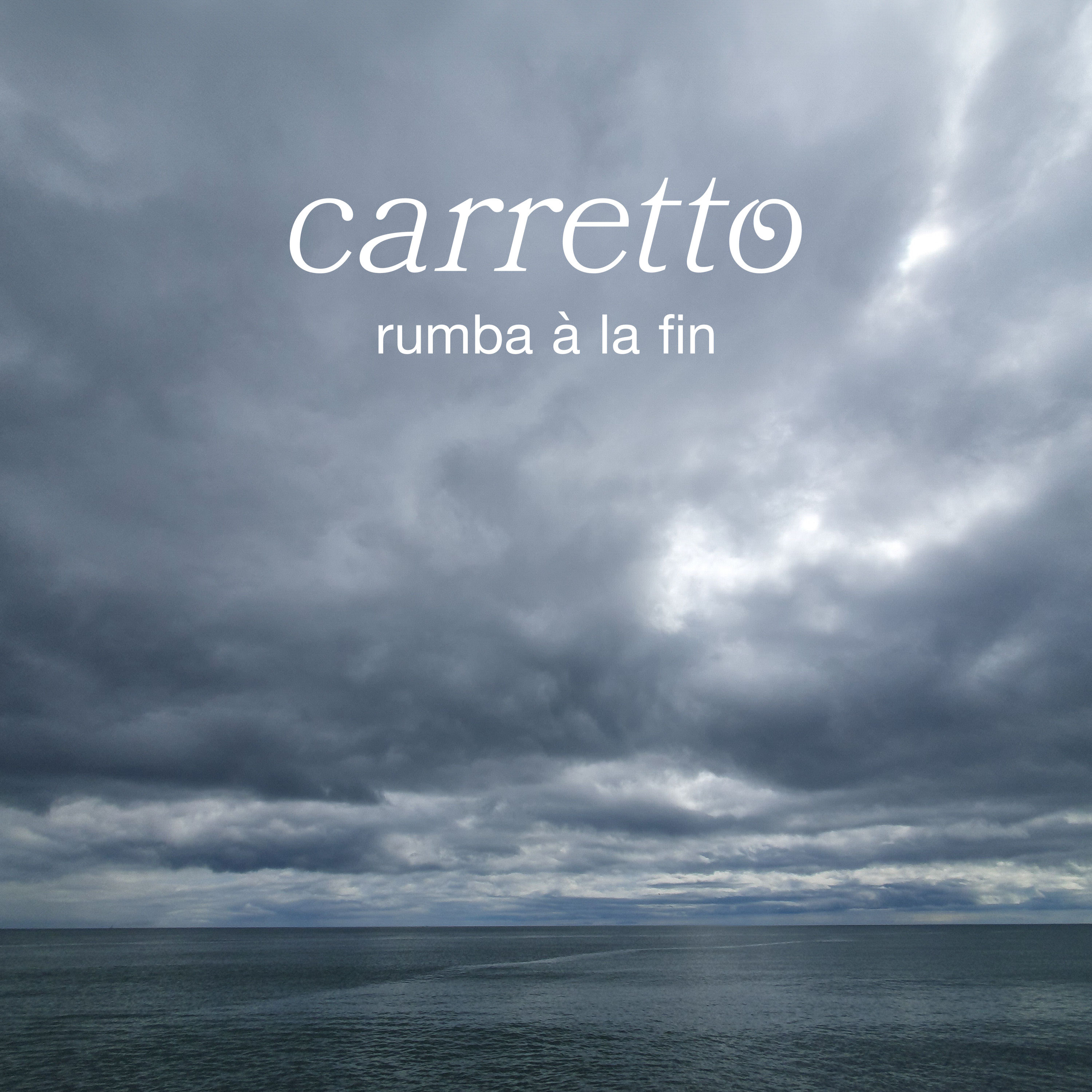
Artwork for the first track from Carretto's debut EP.
EP Track 01
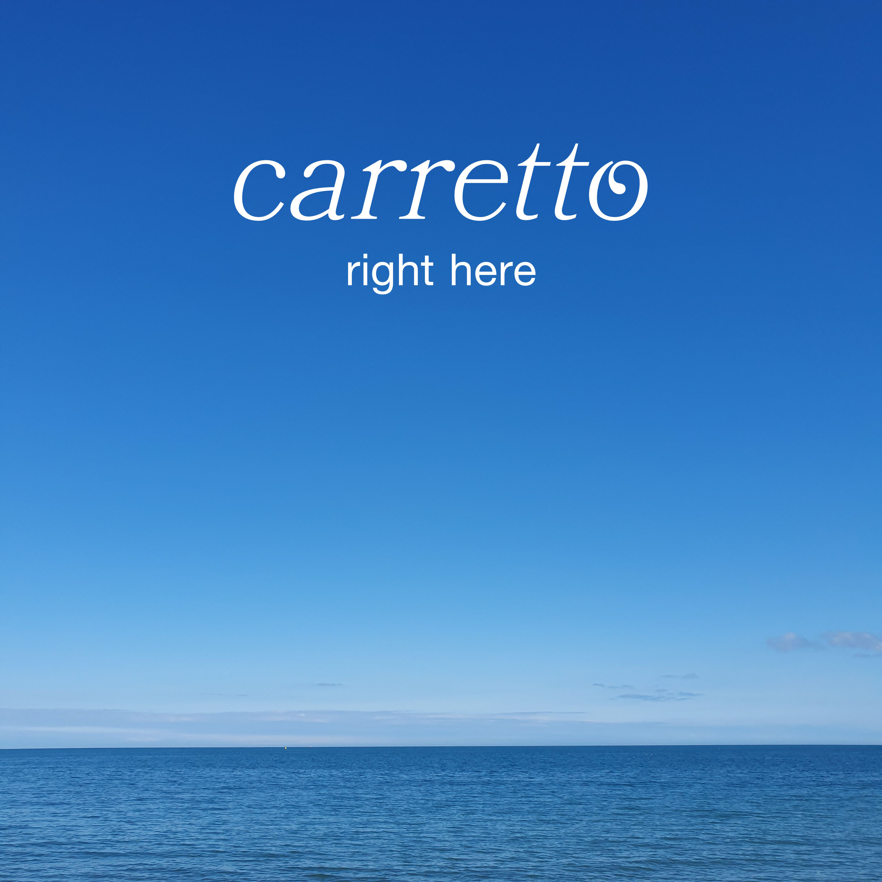
Once Carretto's logo design was finalised, I designed promotional artwork for each of the five tracks on their upcoming EP. The photos used for the artwork came from, or were inspired by, a collection of photos that Carretto had taken during the Covid lockdowns, mostly of the sky and/or the sea.
The first and last tracks of the EP, “Rumba À La Fin” and “Right Here”, are inspired by the concept of seizing/being in the moment, hence my decision to create a visual link between them. “Rumba À La Fin” has gloomier lyrics (“c'est la fin des haricots, c'est la fin des mots”, or “this is the last straw, this is the end of words”), so I chose this photo of stormy skies and dark waters from Carretto's collection to convey that tone.
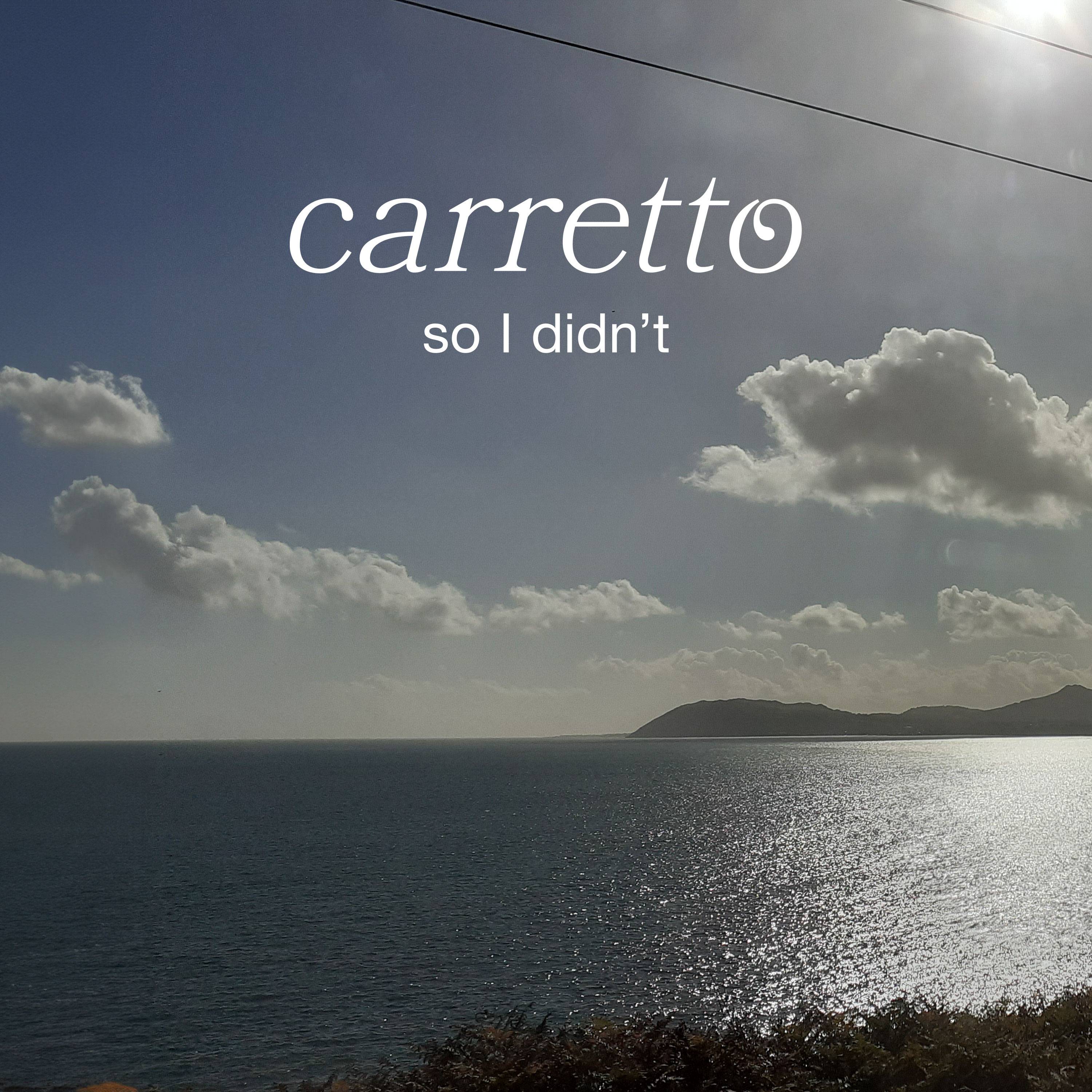
Artwork for the second track from Carretto's debut EP.
EP Track 02
“So I Didn’t” is about the world of work and how people get through the working day, with lyrics inspired by overheard phrases on public transport (“you work all day, you work all day... and at the end of the day, who says no? I don't think I could”).
Unlike the other photos used for the EP's artwork, this one was taken by me. It's intended to reflect the point of view of someone seated on public transport (specifically the DART) looking out the window while overhearing snatches of their fellow commuters’ conversations. The sun shining on the sea's surface is intended to reflect the track’s more upbeat tone and reassuring lyrics (“it’s OK, it’s alright”).
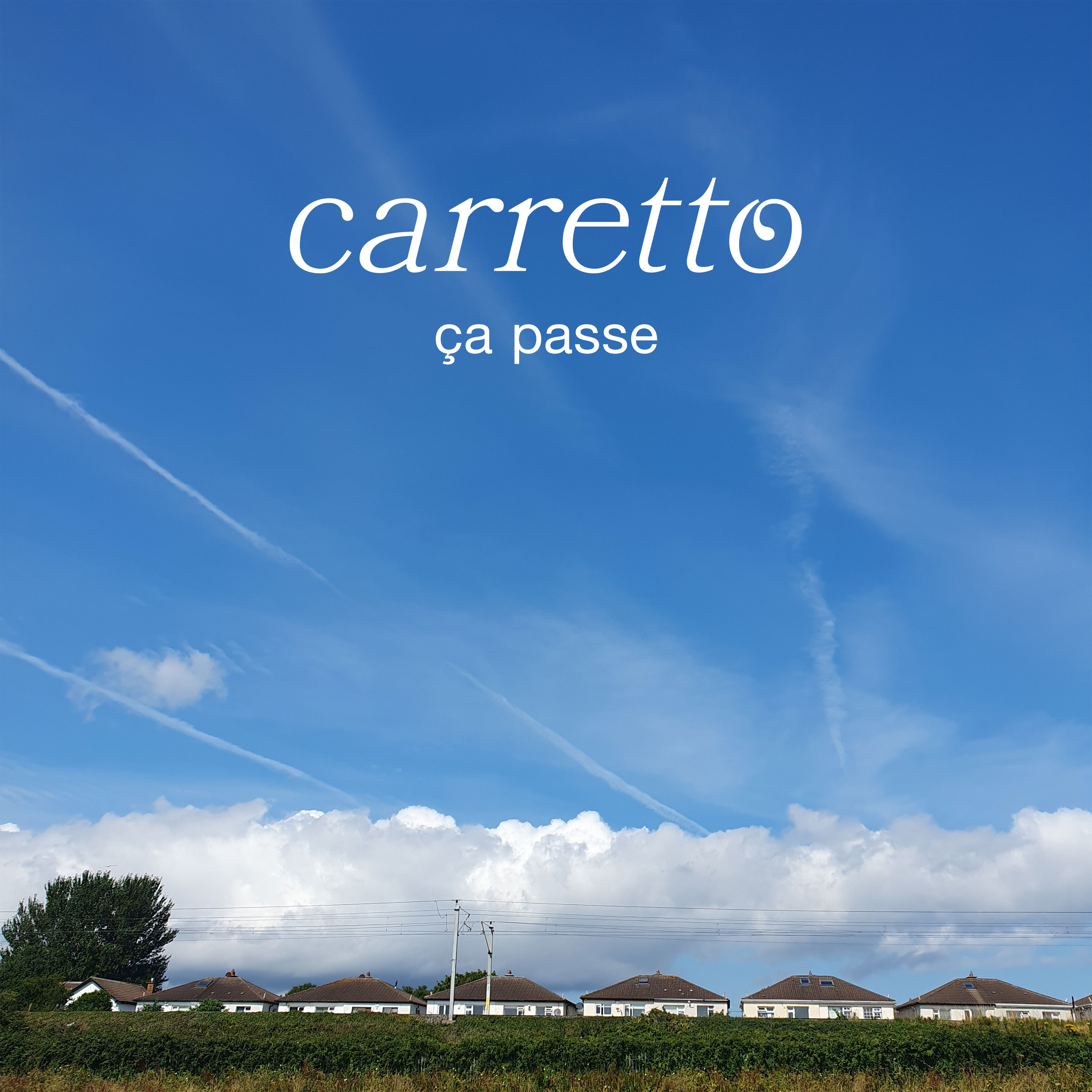
Artwork for the third track from Carretto's debut EP.
EP Track 03
I chose this photo (taken by Carretto) for “Ça Passe” as I felt it visually reflected the beginning and end of that track. The beginning: people isolating in their homes due to the Covid pandemic (“humans in armchairs, humans in rooms”), represented by the row of houses. The end: people travelling after the lockdowns (“humans in airports, humans on roads”), represented by the white trails left by airplanes.
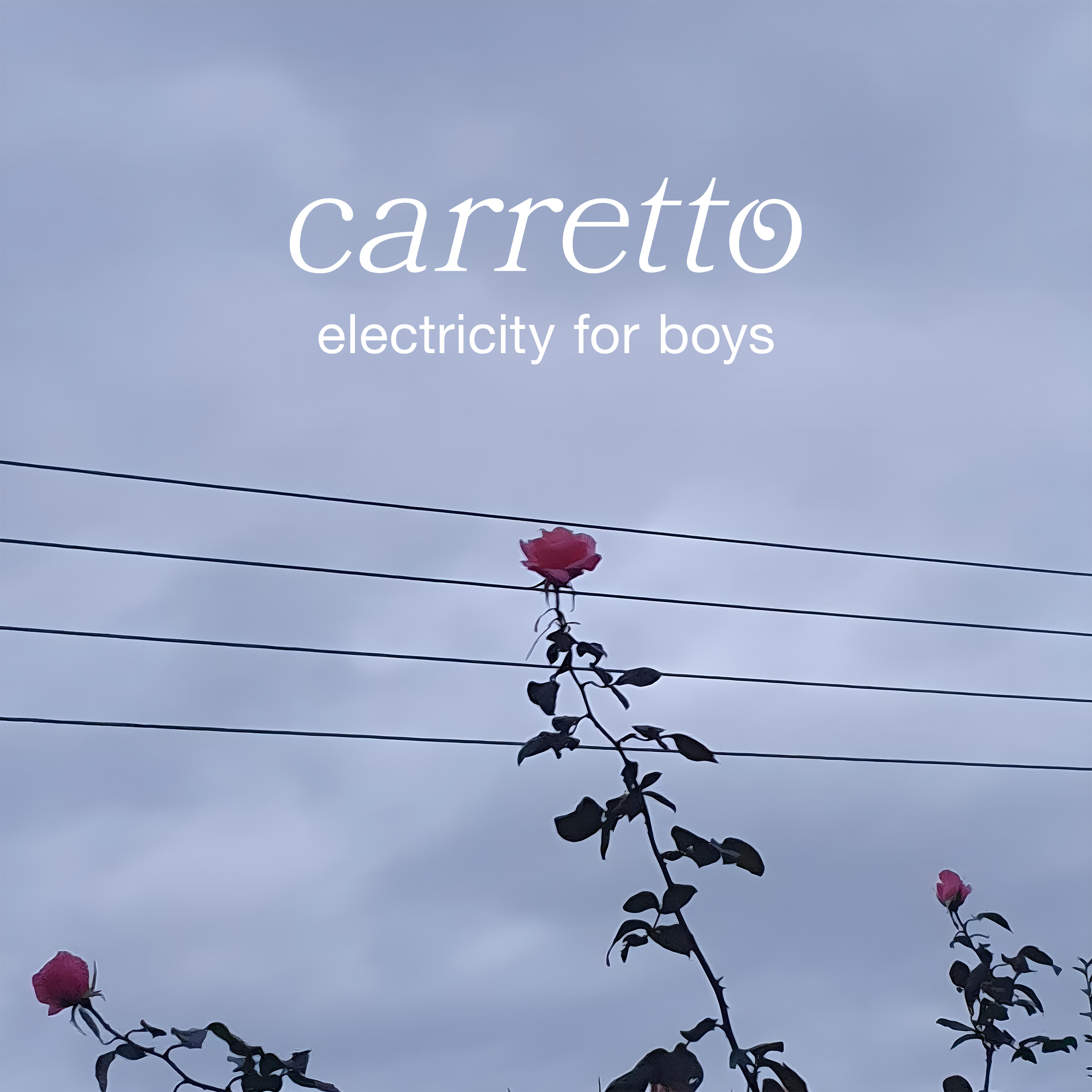
Artwork for the fourth track from Carretto's debut EP.
EP Track 04
The lyrics of “Electricity For Boys” are inspired by the culture of English public schools in the early 1900s (“electricity for boys, scout's honour”), and the fact that many of its pupils at that time would end up in the trenches of World War I (“over the barricades, over your shoulder”). This photo (taken by Carretto) is intended to represent the unsuspecting innocents (roses) caught up in warfare (electricity wires).
